Nicks Pics
The ramblings of a flaneur photographer
Category:
Film
analogue
,
City
,
Film
,
Heritage Buildings,
,
History
,
Photography
,
Uncategorized
Analogue Adventures – Croatia and The Istrian Riviera.
Art
,
City
,
Film
,
Film Noir
,
Photography
,
Technical
,
Travel
,
Uncategorized
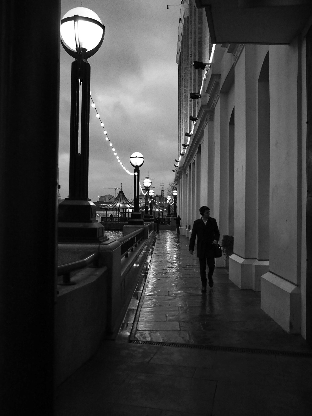
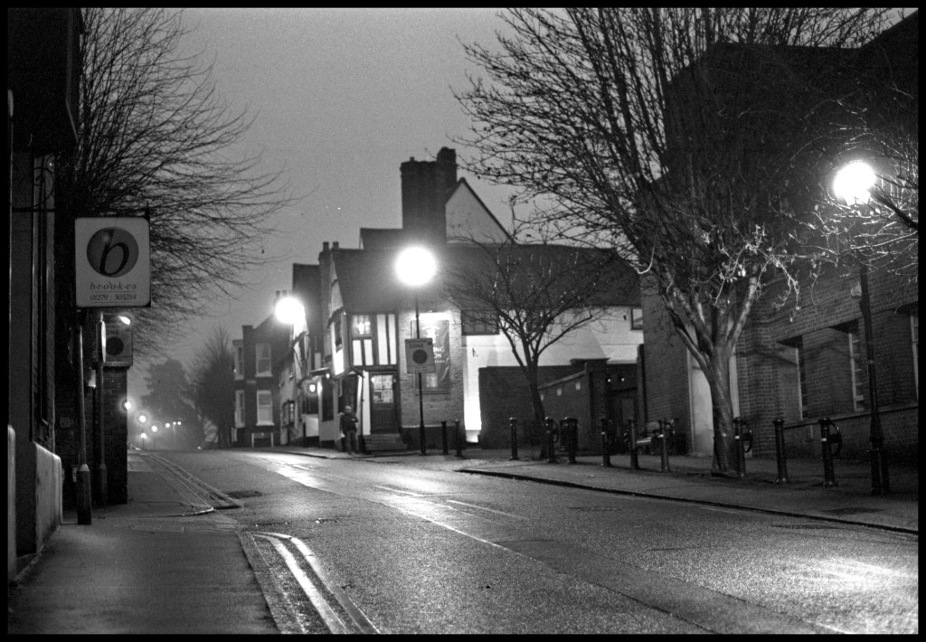
Film Noir and it’s translation into stills photography.
analogue
,
Churches
,
City
,
Film
,
Film developing
,
Film Noir
,
Heritage Buildings,
,
History
,
London
,
Photography
,
Religious Buildings
,
Sculpture
,
Uncategorized
,
walk
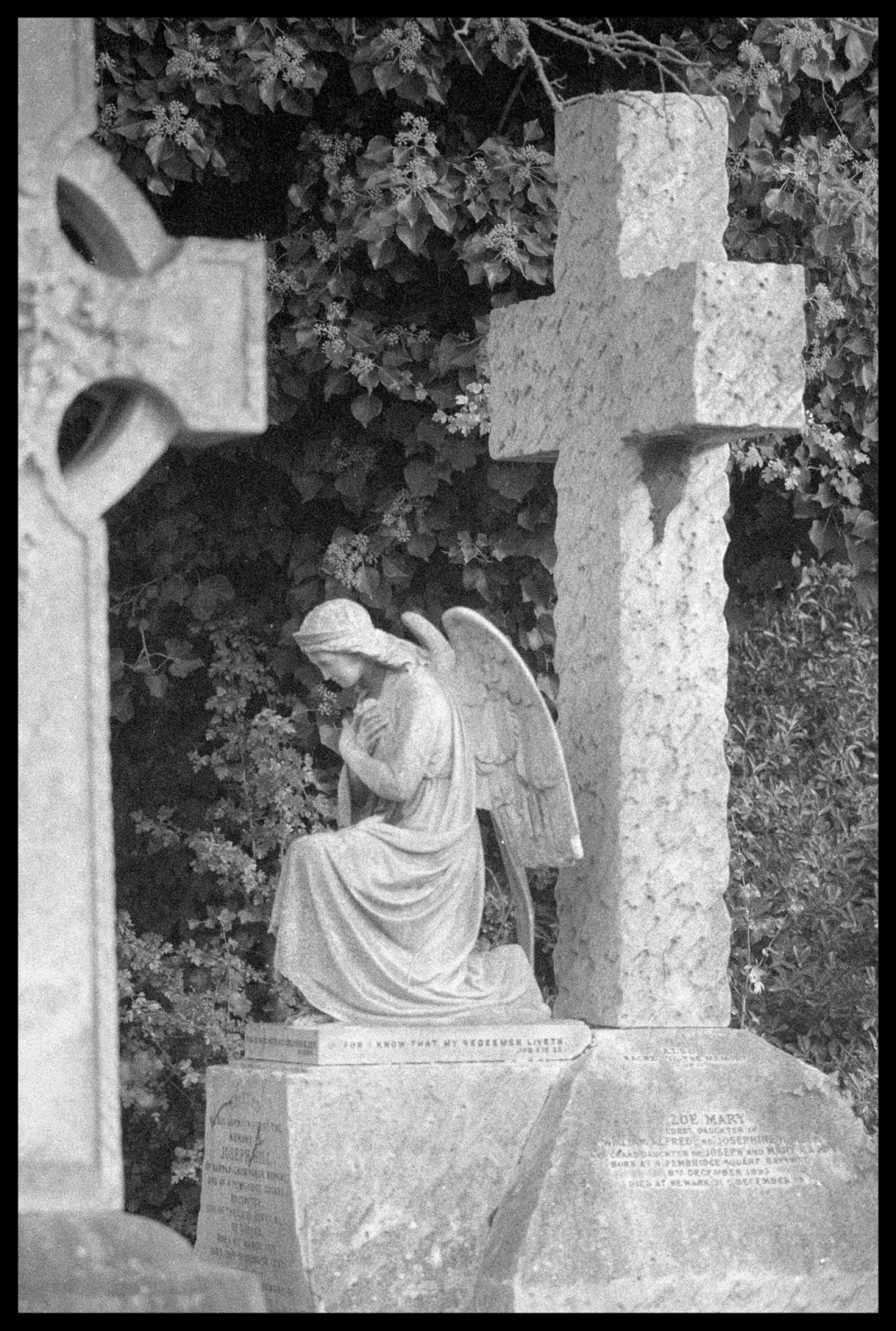
Two Cemeteries Photo Walk
Art
,
Film
,
Photography
,
Technical
,
Uncategorized
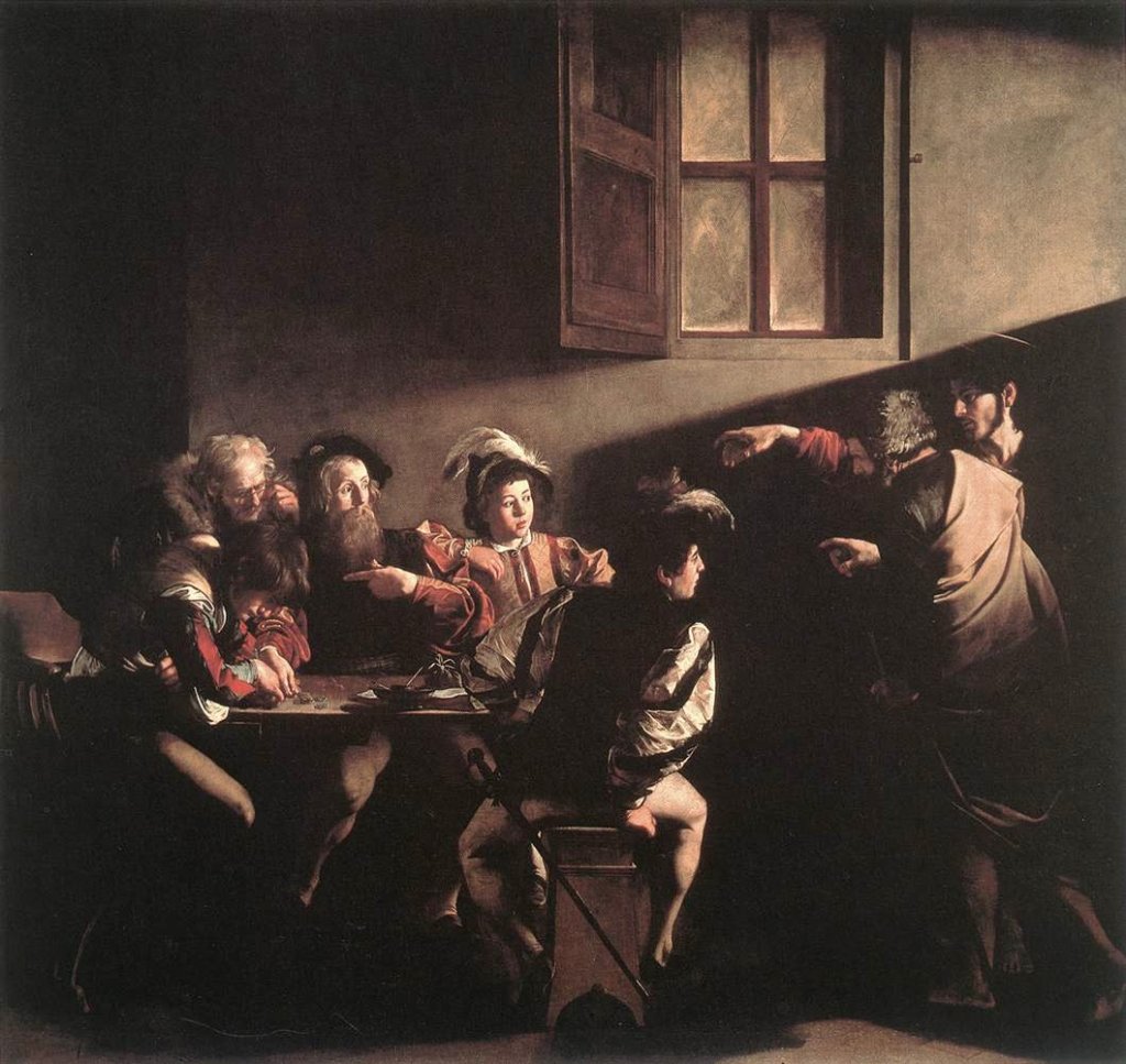
What can we, as photographers, learn from fine art?
Countryside
,
Film
,
Film developing
,
History
,
Photography
,
Technical
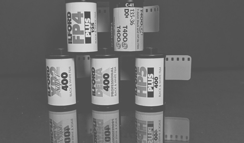
Stand development test.
Film
,
History
,
Photography
,
Uncategorized
Photographing an event. Cressing Vintage Fair.
Art
,
City
,
Darkroom
,
Film
,
Heritage Buildings,
,
History
,
Photography
,
Technical
,
Travel
,
Uncategorized
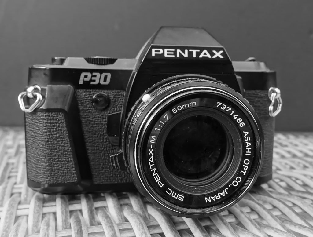
Film Test
Art
,
Darkroom
,
Film
,
Photo printing
,
Photography
,
Sculpture
,
Technical
,
Uncategorized
Lockdown Project – Creating a darkroom.
Art
,
Darkroom
,
Film
,
Photography
,
Technical
,
Uncategorized
Increasing contrast in black and white film – Part 1.
Art
,
Film
,
Heritage Buildings,
,
History
,
Photography
,
Travel
,
Uncategorized
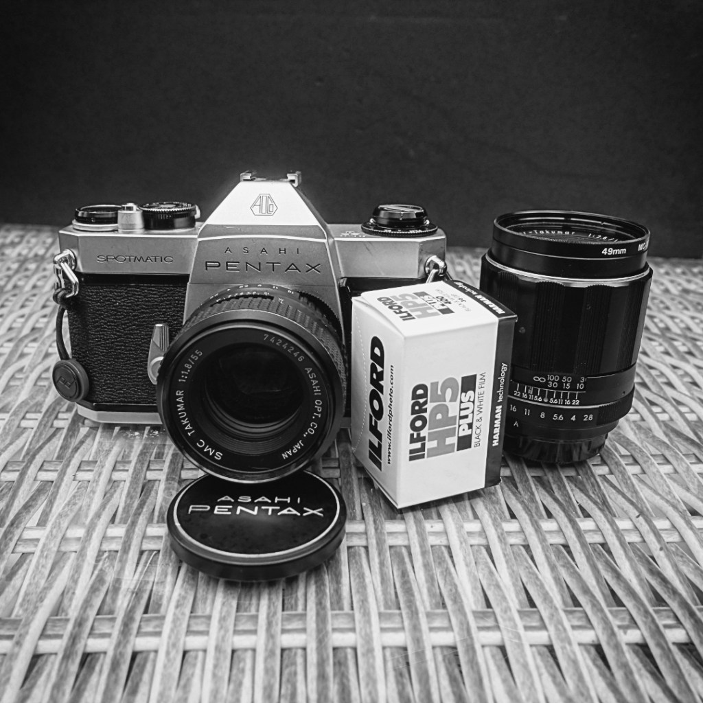
A day at the Fort with the Pentax Spotmatic.
Subscribe
Subscribed
Nicks Pics
Join 53 other subscribers.
Sign me up
Already have a WordPress.com account?
Log in now.
Nicks Pics
Subscribe
Subscribed
Sign up
Log in
Report this content
View site in Reader
Manage subscriptions
Collapse this bar