Nicks Pics
The ramblings of a flaneur photographer
Category:
Technical
Art
,
City
,
Film
,
Film Noir
,
Photography
,
Technical
,
Travel
,
Uncategorized
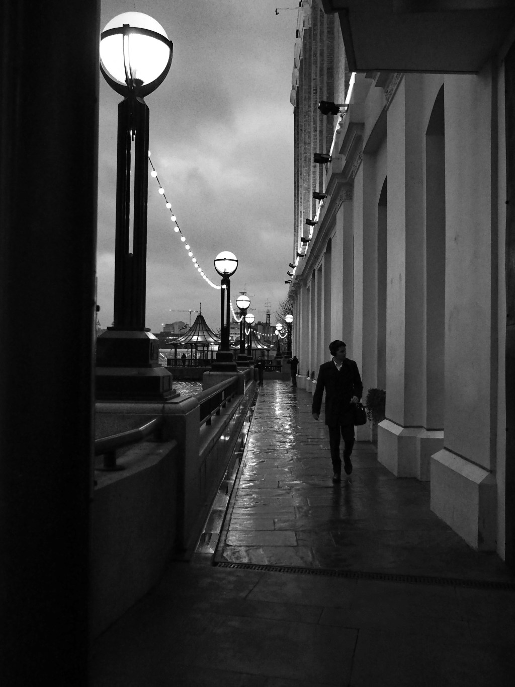
Film Noir and it’s translation into stills photography.
Photography
,
Technical
,
Technical
,
Uncategorized
Using Affinity Photo
City
,
Darkroom
,
Film
,
Heritage Buildings,
,
Photo printing
,
Photography
,
Technical
,
Uncategorized
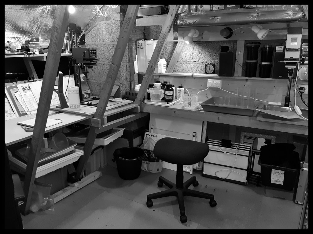
Some darkroom work
Art
,
City
,
Film
,
Photography
,
Technical
,
Travel
,
Uncategorized
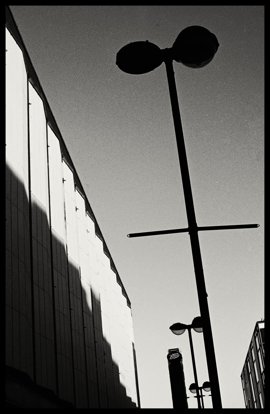
Geometric shapes caught on film
Art
,
Film
,
Gardens
,
Photography
,
Technical
,
Travel
,
Uncategorized
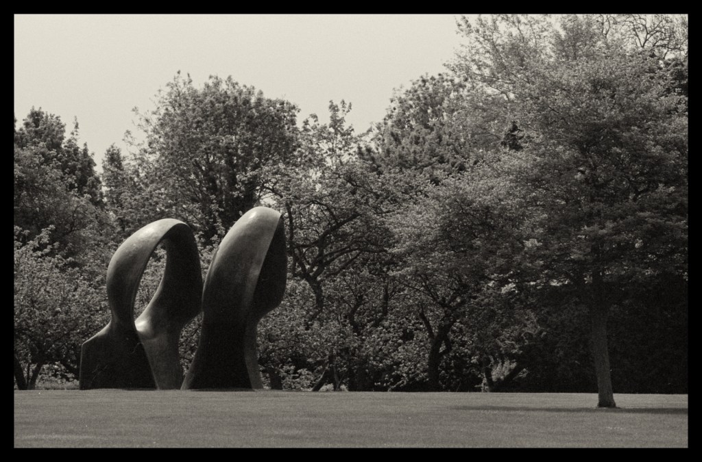
My daily lockdown walk with my OM2n.
Photography
,
Technical
Night time shooting with the Sony RX100 mkIII
Subscribe
Subscribed
Nicks Pics
Join 53 other subscribers.
Sign me up
Already have a WordPress.com account?
Log in now.
Nicks Pics
Subscribe
Subscribed
Sign up
Log in
Report this content
View site in Reader
Manage subscriptions
Collapse this bar